Alex Peak
Diagrammes
Avis
Si vous souhaitez utiliser une de ces images, veuillez cliquer avec le bouton droit pour la sauvegarder sur votre ordinateur. Vous pouvez ensuite la télécharger où il vous plaira, comme sur Photobucket, ImageShack, Tinypic, ou n’importe quel autre des nombreux hébergeurs d’images.
Quoi que vous fassiez, veuillez ne pas établir un lien direct vers les photos de ce site. Le hotlinking n’est vraiment pas cool.
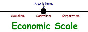
Number One
This chart was designed circa 2004 at a time when I still felt comfortable labelling myself a capitalist, at a time when I considered economic liberty and personal liberty separable, and at a time when I considered laissez-faire to be a moderate or centrist economic position. Today I see this diagram as flawed.
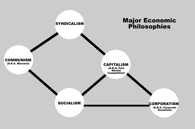
Number Two
This chart was created as a personal aid in my young attempt to make sense of the different approaches to economic thought one could espouse. I never widely promoted it, and with what is probably good reason.
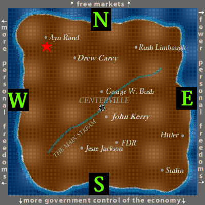
Number Three
Although I did not personally design this chart, it is the results given to me by my favourite political quiz, Politopia. It appears to me to be, by far, the most accurate political quiz online, even despite the error in separating economic liberty from personal liberty.
Unfortunately, the quiz erroneously places me below Ms. Rand, when in fact I am so far North-west that I’m virtually drowning off the cost.
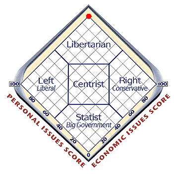
Number Four
Like the above chart, I did not design this one personally. This chart was the results I obtained following taking the World’s Smallest Political Quiz.
Number Five
This light-hearted chart was the product of a pseudo-intense debate between a friend and me on the question of whether a pie can still be a pie even if it lacks a lid. As this pie chart indicates, yes, yes it can.
Number Six
Like the first chart depicted on this page, this chart is deeply flawed. Indeed, I would venture to say this is the most flawed chart on the Internet. It’s unfortunate, therefore, that people actually consider the political spectrum in this manner.
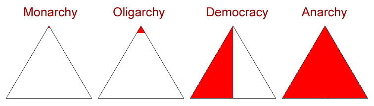
Number Seven
This chart, designed in 2005, is one in which I take much pride. It is simple, yet it expresses breathtaking clarity. I find it as accurate today as the day I designed it.
With that said, if I were to make any change to this chart, I would probably add an entirely white triangle and label it anomie.
Number Eight
This chart was designed for use on Wikipedia. It was developed from an earlier Wikipedia chart that, albeit similar, failed to list either anarchopacifism or market anarchism.
Number Nine
Like the above chart, this was designed for use on Wikipedia. In reading “Facts Concerning the Late Arthur Jermyn and his Family” by H. P. Lovecraft, I quickly discovered that following the genealogy described in the tail was not the easiest of tasks. Figuring that others may experience the same difficulty, I decided to create this genealogical chart to help me, and others, keep track of who begat whom. Thereafter, I uploaded the chart to Wikipedia for the benefit of others.
Number Ten
On December fourth, I designed this chart to graph the growth of fundraising received over the year 2007 by the Ron Paul for President 2008 campaign. Like the above two charts, this was uploaded to Wikipedia for mass distribution.
Although this graph does not show it (as it was produced as early as December fourth), Dr. Paul ended up raising a total of $19,765,974 in his fourth quarter.
There is also an unfortunate error in this graph’s title. The letters should be PCC rather than PPC. Fortunately, this was corrected in later updates.
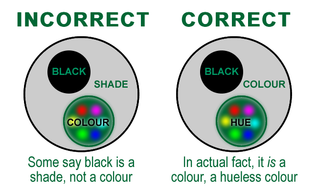
Number Eleven
Some incorrectly believe that all colours are shades but that not all shades are colours, that black is an example of a shade that is not also a colour. In reality, all hues are colours while not all colours are hues—black is a prime example of a colour that is not also a hue. This chart was designed in January of 2010.